(This article is kindly sponsored by Adobe.) Adobe is launching a unique design challenge: Take one of three exclusive icon kits and make an app prototype that helps fellow creatives explore your city.
(This article is kindly sponsored by Adobe.) Every city has its hidden spots: the best place to see the sunset, a cozy coffee shop that makes excellent espresso, or that impressive building you won’t find in any guidebook. As a visitor, you might stumble across little gems like these by chance, but, well, no one knows a city’s secrets as well as the locals, right?
Now’s your opportunity to let fellow creatives see your city through your eyes — and to put your design skills to the test at the same time. Our friends at Adobe are launching the “Prototype your Creative City App” contest. The idea: Use Adobe XD to design an app prototype that helps others experience your city. Show them where you get your creative juices flowing, where you relax after a long day at work, or whatever else might spark your love for the place you live each day anew.
Create an app prototype that shares your city’s best-kept secrets, and win some handsome prizes.
How you tackle the challenge, is up to you, there’s only one requirement: You must use at least five icons from one of three exclusive XD icon kits which Adobe released recently. Designed with a focus on well-made user experiences by award-winning design studio Anton & Irene, legendary designer Lance Wyman, and the Swiss design group Büro Destruct, the icons are bound to add that special something to your prototype.
The deadline is March 15th, 11:59 PM (CET).
What You Can Win
After the deadline has ended, a jury made up of the three icon kit designers and Adobe’s Michael Chaize will select the winners.
1st Prize
An all-expenses-paid trip to the leading creative conference Adobe Max in October 2018. Plus a one-year Adobe Creative Cloud subscription and 100 stock images.
Top 10 Prizes
A one-year Adobe Creative Cloud subscription and 50 stock images.
How It Works
Want to join in? Here’s everything you need to know:
Make sure you have the most recent version of Adobe XD installed. You can download a free trial. If you have an all-apps Creative Cloud subscription, XD is already included — just download it from your CC app or here.
Create your mobile app prototype using at least five icons from one of the three kits. Show your city and share your favorite places. Or consider using one of the curated selections.
Publish your prototype on Behance with the tag #IconContestXD and tag the Adobe tools you used.
Share your work on Twitter using the hashtag #IconContestXD. Deadline: March 15th, 2018, 11:59 PM (CET).
You’ll find more information, as well as tips and XD tutorials to get you started on Adobe’s Spark page. Good luck!
If you’re a designer hired to build a company’s website, your plan is also a proposal that you’ll need approved and signed off on in order to more forward with the project. Rules vary by country and type of business/organization, i.e., government agencies have a different process to follow than private businesses, but generally speaking you’ll need a signature from a key decision maker — someone with the authority to approve the work and pay you.
If you’re building the site internally with company resources, your plan is the working document for the project.
There are many ways to write a plan, but a good one will cover the following, incorporating some of the elements you’ve ironed out previously:
The important thing is to provide a clear description of what the feature does, and if possible, link to an example of the feature in use. So instead of just saying “Slide show,” try:
Slide show
Javascript-driven image rotator. For each image display: panoramic image (16X9 ratio), title overlay and link. Provide next/previous buttons and current slide indicator. Maximum 6 images. See demo at someurl.com/slideshow.
Third party content
If you’re integrating any third-party services like an email newsletter, Twitter feed, etc., it’s important to define very clearly how they will work, and what degree of integration you’ll provide. Some third party content, like a Facebook Friends Grid, might take 10 minutes to integrate, others could take a full day, or even more if building a custom component completely from scratch using a third party API.
Milestones
A list of key points in the project, and what the deliverables are for each. Again, depending on scope, this may be 30 days or 6 months. Here’s a set of milestones for a project of 107 days, or about 3 1/2 months. This is a just an example — yours may look quite different.
Day 1 Discovery meeting (designer and client)
Day 7 Content Strategy session (designer and client)D
Day 21 Initial designs presented to client
Day 28 Design feedback provided to designer
Day 35 Designs (with revisions) presented to client
Day 40 Designs approved by client
Day 42 Begin front end development (HTML, CSS, Javascript)
Day 63 Setup CMS and integrate front end assets
Day 84 CMS setup complete; CMS training; content entry begins
Day 100 Beta test
Day 107 Launch
Terms and legal language
Designers often skip this, and almost inevitably get burned when a project goes wrong. Take a moment and tell the client what all that tech-speak means! Telling the client in plain English will save a lot of trouble in the long run. The maxim: “Information is power” is absolutely true, and inviting clients to ask questions about technical terms can make them feel comfortable when they feel overwhelmed by tech speak and avoid confusion in the process. See our sample proposal/contract for more.
What’s all this going to cost?
If you’re developing your entire site internally, then cost consists of:
Time spent by your employees.
The software on which the site runs, including updates.
Hardware, i.e., the server on which the site is hosted.
If you’re contracting out the work, then the answer is “it depends.”
Checking credentials
Website design, including all its various components, is a professional service. But hiring a web designer or firm is nothing like choosing an accountant or attorney, because web design is not a credentialed field and is often collaborative in nature. That is, the person on the design team doing the design, the user interface elements, mockups, etc. may not be the same person doing the coding (the creation of front and back end markup). Even in small web teams, it’s standard to see multiple people coming together to create the finished product, each with their own specialty, skill set and training.
You may come across web professionals with degrees or certifications in computer science, graphic art or related disciplines, even the occasional SEO guru or social media wizard. But due to the dynamic, ever evolving nature of the field, and its relative newness, it’s unwise to rely on credentials to determine the skill or experience of the professionals you hire. Frankly, although they do prove that a given professional has invested in his or her craft (which is never a bad thing), they don’t mean a whole lot in the real world. There isn’t really a single regulated, unified body of experts handing out credentials to web professionals as proof that they know their stuff.
There are, however, very respected professional associations for designers in just about every country on earth. In the U.S., the AIGA and the Freelancer’s Union offer memberships with benefits (including continuing education) to many professional designers.
While some individuals or firms may be quick to throw out numbers, experienced web professionals are wary of quoting prices until they have a clear understanding of your project’s scope. You may be able to get a ballpark1 figure — your five-page restaurant site should not cost $20,000 (unless it includes a custom- built online ordering system), and a 100-page site for a 50-employee business will not cost $5,000, unless you want it to look like a small child designed it. One useful way to approximate cost is to find a project of similar scope to yours (an educated guess until you do a needs assessment) and inquire about what that project cost.
1 For readers unfamiliar with baseball, this is a metaphor which means “a general range or idea.”
Let’s not forget website maintenance
While the building of a site can vary enormously in size, scope and cost, the finished site isn’t the end of the road. A site will need to be proactively maintained as long as it’s online. A reasonable expectation of costs for yearly maintenance is 10 to 25 percent of the site’s initial budget. So regular maintenance on a $20,000 site could run $2,000 – $5,000 per year. (Obviously, more complex revisions, updates, etc. will cost more than that, but this is a good ballpark for basic normal maintenance.)
If this figure is surprising, remember that successful sites are not built and forgotten, but maintained and improved. As your business grows and changes, your website should reflect this. Technology changes too, as does the ecosystem your site lives in — security holes will appear and need patching, updates will need to be made over time. Think of yourself as the steward of your website, facilitating its ongoing health and happiness over its lifetime.
How To Evaluate And Choose Web Professionals
As noted earlier, I am not a fan of the RFP (Request for Proposal). RFPs try (and usually fail) to reduce a creative, dynamic process to a series of numbers and milestones, without sufficient information for these benchmarks to be accurate. But without an RFP, how do you choose a team? Following these three steps will maximize the likelihood of choosing a good firm.
1. Ask for referrals
When possible, getting referrals from business owners who have worked with the service provider in the past is a good start. The most valuable referrals come from people who have hired the individual or firm in question for a substantial project. Just because someone created a really great PowerPoint presentation for Leticia Gomez, president of Gomez Manufacturing, does not mean that this person is qualified to create a 200-page website for your science foundation or radio station.
2. Consider substantial projects
Smart designers always put their favorite, most successful, or most visually appealing work in their portfolio. But how a website looks is not necessarily an indication of its function. It can be very difficult for the layperson to tell just by looking at the site in a browser whether or not the site is well-structured and correctly built, let alone what went into building it. Having the designer take you through the needs assessment, design and development process of a substantial project they have completed will give you an idea of how they work. The process itself is just as important as ending up with a beautiful end result. Ask the designer:
What were the initial assumptions going in to the project?
How many people were involved?
How long did it take? Were project milestones met, and if not, why?
What was the client’s feedback on the project?
If you were to build it again, how would you work differently?
3. Meet them
There’s a maxim in business that people prefer to work with those they like, know and trust. The “like” part can be established by a nice old-fashioned face-to-face meeting. If the designer lives in another city or state, the phone is the next best thing, and there is always Skype, FaceTime, Google Hangout, etc. so that you can virtually “meet” and get a sense for the person.
Many designers are willing to sit down for an hour and talk about your needs. Get a sense of how this designer will address your project, but avoid fishing for ideas. You wouldn’t ask an architect to “just have a quick go at a blueprint for us,” for free, and you shouldn’t ask designers for specific, in-depth solutions to your problem. Instead, take this opportunity to learn how they relate and what kinds of questions they ask. This is a good time to review one of their past projects, as noted above. Your goal is to learn about them, their people and process, and whether they’re a good fit for your business.
Note: by no means are face-to-face meetings required for a successful project. While there are advantages to working with web professionals local to you, working virtually can provide great results too. If the people you’re considering can’t meet in person, consider a web conference instead.
Things not to rely on when choosing web professionals
“My cousin’s friend just started a web design certificate at Metropolis State College, and he says that UltraPowerCMS is the best, hottest new technology for building websites! So you should really get someone who works with that.”
Ask a professional what the best tools for the job are. Don’t make an important business decision based on hearsay. (You wouldn’t tell your plumber which tool to use while fixing your toilet — you’re not really qualified to make that call. Even if you’re a plumber yourself, the professional you hired probably has a good reason for doing it her way — let her do her job.)
“I know this guy who will do your website for $500. You should call him!”
You get what you pay for. If it seems too good to be true budget-wise, it is. Period. (You’ve read this far, so you know your project cannot be done well for the cost of a smartphone.)
“The woman who manages our network administration says she can do it.”
Get the right person for the right job. (Don’t hire an airplane pilot when you need a ship’s captain.)
But have you designed a site for a restaurant/car wash/toddler Parkour center?
Sometimes, when judging whether or not a design firm is a good fit, businesses will fixate on their own industry, wanting to see examples of work for a business just like theirs. While there are cases where specific industry knowledge and specialization is valuable, in most cases, a good design firm doesn’t care what industry you’re in. They’ll follow the same needs assessment process regardless.
Everyone has a product, service, or benefit to communicate — frankly, it doesn’t matter if you’re selling baking supplies or cold fusion reactors. The designer’s job is to create a product that works specifically for the client’s business, in their industry. Good design is good design, and a skilled designer can design for just about any industry, whether they’ve done so before or not. Sometimes, not having specific knowledge about an industry can be an advantage, as it will be sen with a fresh perspective. See If Carpenters were hired like web designers for more on obsessing with designs for a particular industry.
Roles: who’s doing what?
Businesses are often surprised that it “takes so many people” to build a “simple website.” There are certainly lots of designers out there who wear multiple hats, and do so brilliantly, but more often there are specific skill sets for specific roles — just like with any collaborative endeavor. You wouldn’t expect the electrician to also be the carpenter, plumber and landscaper. It’s the same in web design and development. Each role has specific skills, talents and responsibilities. Knowing what these are can help you to communicate during the building of your site, and keep information flowing smoothly for the life of the website.
In smaller firms, it’s very common for the business to communicate with only one or two members of the team. Don’t worry, the entire team’s working on your project, you just can’t see them. It’s not really an effective use of anybody’s time for the business to have a phone conversation about the finer points of JavaScript development for a particular module. The flow of communication works a little bit like a waterfall — the business will communicate with one or two people on the team, and they will, in turn, communicate with the rest of the team. Team members will interface with the business as needed, but the business should not expect to regularly speak to the entire team.
While each project is different, following are the typical participants and roles in a sizable web project. Your project may have people with slightly different job titles, but in all likelihood the ground will still need to be covered by someone on the team.
Internal stakeholders (representing all primary aspects of the business)
This may be one person, or a small group. Be sure to read below re: design by committee.
Project manager
The project manager’s role is much like in any other project, but it’s important that he or she be familiar enough with the web project process to make informed decisions and recommendations about approach, timeline and roles.
Content strategist/information architect
Helps plan, organize and prioritize the site’s content and structure, including navigation. May also be responsible for editorial workflow, that is, the process an organization follows to move content from first draft through approval stages and finally to publishing. The larger the scope of a project, the more this role will be necessary. On smaller projects, these tasks are handled by the project manager and/or web designer.
Content creators
One person from the business, at minimum, responsible for writing and providing other types of content. Splitting these duties among multiple people is strongly preferred.
Copywriter/editor
Often overlooked in the process, a copywriter/editor can make your writing more appropriate to the audience, more relevant, more engaging. Writing for the web is different than writing for any other medium, and the quality of the writing on your site effects everything from your SEO to the engagement (or lack thereof) of the audience. Ideally, businesses should work with a writer who has experience working with web copy. Smaller companies do not typically have a skilled copywriter on staff, so you must bring in a third party.
The copywriter will either ask the business to provide a rough outline to build on, or will start by interviewing key staff at your company, creating finished copy based on their notes. Sometimes it’s a combination of both methods, but a copywriter will engage with the company in a detailed way to create the best possible writing for a site. Professional copywriters can save you a lot of time and improve the quality of your website.
Web designer
In addition to creating the visual look of the website, the creation of every single user interface element on the page, the style of the text, placement and layout of photos — the entire page top to bottom, the web designer may also provide graphic design, interaction design, illustration and animation, as part of the work. They may also have a role in managing user experience (“UX” — which is exactly what it sounds like — the experience of your website’s users).
Front end coder
The coder will translate visuals presented by the web designer into HTML, CSS, JavaScript and other technologies used to create the output of web pages. This code is generally called “markup” and it’s the stuff you can see if you use the “View Source” feature in your browser — as well as the stuff that Google and other search engines interact with in order to index and rank your website in search engines.
The coder’s work is done discreetly from other aspects of site creation. Typically, the coder will take the designs and guidelines supplied by the web designer and days or weeks later, produce piles of code and assets (graphics, videos, etc.) used to assemble the finished website.
Web/CMS developer (“Back end” coder)
A modern website of any size will be built in a content management system (CMS). The CMS developer will integrate the code and assets created by the front-end coder into the CMS, stitching the visible bits, called the markup, to the invisible bits and creating the site itself. The CMS developer also deals with the database that holds your content and the server on which the site lives. This person is ultimately be responsible for making sure all the assembled parts play nicely together.
Since all CMS are not the same, each with different programming languages and ways of doing things internally, you’ll need a CMS developer who is skilled in using the CMS you’re creating your site with. A CMS developer may be utterly fluent at creating sites with WordPress, but not have a clue what to do with Drupal.
TIP: This is by no means an exhaustive list of all the jobs in web development. Keep in mind that one person may play multiple roles, or you may divide roles or tasks further. The number of participants working on a project does not reflect the quality of the end result. In some cases, a series of one-on-one meetings between company principals and one experienced web professional can yield a great site.
You’re using project management software, right? This should almost go without saying, but your web project will greatly benefit from project management software. Keeping track of message threads, files, revisions and tasks among multiple project participants becomes very messy very quickly when run over email — don’t do it. In my business, we became so frustrated with email-based project management, that using our preferred project management tool is a condition of working with us. Whether you prefer Basecamp, Trello, DaPulse, or another system, learn one and use it.
Where Will It All Run? Choosing A Content Management System (CMS)
A CMS is a software program that allows you to publish, edit, manage and display your website’s content. Typically you will integrate your approved design into the CMS via some form of templates which ultimately display (“serve”) functioning web pages to site visitors. These templates may be written in any number of web programming languages like PHP, Ruby or Python, or use a tag language like Smarty or Twig. Again, each CMS uses its own language.
When choosing a CMS, there are four key questions to answer:
Is it widely used and supported?
Is it relatively stable? Are there known security or other stability issues?
Does the person or team developing in it have the necessary expertise?
Will it support the layout, features and functionality the site requires?
“One dude in a basement built this for us” — avoiding proprietary solutions
A CMS is software, and with any software there are products used by hundreds, thousands or ten of thousands of users to fulfill a specific need. There are many solutions to choosing from, and advising you on specific software is outside the scope of this guide. But there is one major pitfall to be aware of: some web design firms write their own CMS from scratch, making it a key part of the service they offer to clients. Some of these CMS are great, some decent, and some lousy. But this matters less than the core problem with a proprietary CMS: if that design firm goes out of business (and they often do), support for their CMS disappears. Now your website is tied to a complex piece of software which nobody supports. No improvements, no bug fixes, no security updates. And quite commonly, such software will have little or no documentation — no record of how it was built, how the pieces fit together.
In the best case scenario, you might (try to) hire someone to poke through the software and update the code, but this can be difficult, expensive, and you’re throwing money at a piece of orphaned software that no one else will ever use. Many developers simply will not take this kind of work — it’s not worth assuming responsibility for something they didn’t have any control over the creation of.
When choosing a CMS, consider one that has a wide user base and options for paid support, whether from the vendor or third parties. When you choose a CMS that has 10,000 installations across 20 countries, there’s likely to be a strong financial incentive for people to support and improve it. Here’s a good resource for choosing a CMS.
WordPress, the 800 kilo gorilla of CMS
WordPress is the most popular open source CMS in the world — there are more installations of WordPress running than any other CMS. It is free to download, open source, and was originally developed as a blogging platform. For some websites, it is an appropriate solution, but for many, it is not.
Due to several factors: its popularity with designers, its cost (free)2, its huge array of themes, and — very importantly — name recognition, WordPress is often chosen without even considering other solutions. It’s not the purpose of this guide to tell you which CMS to use. But it’s important to first complete your needs assessment and then choose your CMS. The needs of the organization should drive technology choices, not the other way around. Just because something is free and commonly used doesn’t make it the right choice, and there are issues that come along with being the most popular kid in school — security being the most important (the most common usually also means the most hacked), but structure should be considered too. Think carefully and ask your designer before picking a CMS.
2 While free, WordPress, like all software, needs regular updating and attention to security, and these critical services are not free. WordPress’ popularity also makes it a common target of black hat hackers (the malevolent kind).

Trusting the designer
Most designers have one or two CMS they specialize in, and if their honest assessment of your project is that it will work well in their CMS of choice, then the decision comes down to trusting the designer.
Dealing with your Information Technology (IT) person or department
In some companies, IT may put up resistance to the technologies you choose to power your website, especially if they are expected to support it. For example, you may choose a common CMS which runs on a Linux server, but your IT department is centered around Microsoft products.
Have sympathy for the embattled IT professional, as they rightly worry that someone will add to demands of their job without providing the resources or training they need to support new technologies.
While every business’ need is different, in most cases, websites that don’t require complex integration with other software can be hosted external to your company. If your IT department makes a fuss about supporting your chosen solution, you should strongly consider hosting it externally. However, if your project is especially complex, requires high security or intensive monitoring, you may need the support of your IT department or specialized external resources. Whatever you choose, make sure the people supporting your particular solution are versed in dealing with its unique challenges. And if there’s no good in-house solution, don’t hesitate to look elsewhere for people who can offer these services.
Determine site content
Who’s responsible?
As you determine content for the site, you should also be thinking about who will contribute it. Remember, it’s not the designer who will generate your content — that’s up to you (or perhaps to the copywriter you’ve wisely hired). In a five-person business, it may be just two of you, and that’s fine. In a larger organization, there may be five, ten or fifteen people contributing content. In this case it is wise to assign a project lead who will create an editorial calendar, assign writers, and establish deadlines.
Keep in mind that the time required for editing and proofing copy and visuals grows exponentially with the number of people contributing content.
“We had no idea it would take this long!”
If I had a dollar for every time a client admitted this, well, I’d have a few hundred dollars. Organizations consistently underestimate just how much time it will take to create, edit and organize their website content. Business owners often express concern about the designer’s ability to meet deadlines. A common response to the question “When do you need this site completed?” is “As soon as possible”. A designer may set aggressive timelines at a client’s request, knowing that the business will rarely have content assembled and entered in to the CMS anywhere near as quickly as they expect.
There’s no hard and fast rule for how long it takes to assemble content, but for written material, allowing for an average of 300 words per page, consider how long that will take to write and edit. Then multiply that by the number of pages. For example, if it takes one hour to write 300 words, and a half-hour to edit them, that’s 1.5 hours X 40 pages = 60 hours. Good writing takes time, good photography takes planning and resources, and videos that people actually want to watch must be planned, scripted, shot and edited. Keep this in mind going in to your project, and schedule accordingly.
Especially when it comes to writing, consider having multiple people in your organization share the work. A dose of realism about how long content creation will take is key to setting — and meeting — deadlines.
Content is not just text
Unless you are creating the dullest, most technical site imaginable, your content should consist of more than just plain text. By using one or more of the following multi-media elements, you’ll greatly enhance the appeal and usefulness of the site:
Photography
Documents (usually PDFs)
Audio
Podcasts
Interviews
Playlists
Video (i.e., YouTube, Vimeo, or self-hosted).
Content feeds from other websites, for example: Twitter, Facebook wall content or friends grid, Instagram photos, YouTube/Vimeo videos, RSS Feeds
JavaScript, Java, Flash, Quicktime. These are powerful tools for video, animation, and interactive features, for example, a mortgage calculator. However, all but JavaScript do not work consistently across mobile devices. When considering one of these technologies, first ensure your audience can access them.
THE VALUE OF QUALITY PHOTOGRAPHY
As with other elements of the website, photos reflect the image of the organization. If you’ve just moved into a beautiful new building or storefront, you may have snapped some pictures of the building and staff on your $150 digital camera. In most instances, unless you have bona fide photography skills, you will not turn out quality photos. Don’t make the mistake of thinking you can take good photos just because you have a good camera — it’s not about the camera. Try to budget for professional photography. You don’t necessarily need a lot of photos, just good ones. Twelve professional images are always better than fifty amateur snapshots.
There isn’t an organization that won’t benefit from good visuals, but it’s especially important for industries that produce tangible visual results, like home remodeling, interior design or automobile restoration. It’s incredibly silly to complete a $50,000 kitchen and not budget $500 for a photographer (1% of the total).
If your budget simply doesn’t allow hiring a pro, you can always contact your local art school or community college and ask for a recommendation for a talented student. A budding photographer with a good eye will work cheap in order to build their portfolio.
If you truly have no budget at all, take photos yourself. Pay special attention to lighting, framing and focus, and hope for the best. Taking a large quantity of photos and sifting through them later can improve the chances of a quality shot, and simple fixes (adjusting levels, removing red eye) in Photoshop or other image editing tool can further enhance them. Keep in mind, however, that no amount of “fixing it in Photoshop” can rescue a really bad photo.
In some cases, stock photography may be used for more generic images. But there is no substitute for quality photos of your staff, storefront, products or services. If you want your website to feel uniquely like you, then you’ll need to reflect this in your photos.
The value of quality writing
As with good photography, the ability to write well is not a skill possessed by all. As I mentioned, writing for the web is a different endeavor than crafting memos, policy papers or technical writing. You or your colleague may be great at writing operation manuals for precision machining tools, but that doesn’t mean you can write well for the web. If you don’t have someone in your organization who can write clear and concise marketing copy, hire an expert. If you can write reasonably well but need some guidance, consider hiring an editor to polish your output.
Writing for the web: quick guidelines
Consider your audience and write for them. Try to see your business from the customer’s perspective. What do they need to get out of the experience? What do they care about? Answer the questions they have about your product or service throughout the site — not just in an FAQ (Frequently Asked Questions) page.
Avoid business-speak, confusing acronyms, dry details. Your customers do not work at your shop, office or widget factory — they purchase your products or services. Speak to them accordingly. When appropriate, put generalities in your web pages and save the hardcore details for a voice-to-voice conversation, or even better, offer multi-page PDFs for download on the site. This approach is especially useful for product information, white papers and any copy that approaches or exceeds a thousand words.
A useful approach when writing for the web:
Write your first draft
Cut it in half
Cut it in half again
Now add bulleted and numbered lists where possible
Keep your sentences short
Use paragraph breaks whenever there’s a slight change of flow in the copy
Send it to the editor.
Reading on a screen is fatiguing. A screen, whether massive 26-inch monitor or diminutive smartphone, projects tiny points of light at your eyes. Consequently, reading large amounts of text can be very tiring. Because of this, readers will scan for key points within your text. That’s why short blocks of copy and bulleted or numbered lists are so helpful, because they’re easy to spot. Try to make each paragraph/section encapsulate a single idea.
Create strong headlines. Consider reading a newspaper — it would be very hard to read without headlines. Headlines break up the content, give it hierarchy and, like lists, make it easier to spot what you’re looking for.
Customer-oriented copy
Since the end goal of most business websites is to drive sales, your website’s writing should be oriented towards your customer.
Let’s say our business is an auto body repair shop. The common approach is to say something like “In business since 1976, Acme Auto Body proudly provides top quality service to greater Metropolis.” This may be accurate, but it’s pretty meaningless to the customer. It doesn’t actually tell us much about Acme, what makes them different or why we should go there. While you should talk about your company, the most effective language frames everything you do in terms of your customer.
What are their needs?
What are their desires?
What are their fears?
Our auto body repair customers typically call after their car has been damaged in an accident.
Their need is to have their car repaired so they can drive it again.
Their desires are to have the repair done fast, at high quality, and with a minimum of hassle.
Their fears include getting ripped off, shoddy repairs, a difficult process, or repairs taking too long.
Referring to benefits instead of features better resonates with customers. Just listing everything you offer is not as compelling as framing each item as a benefit, or a solution to a problem.
If our shop offers free loaner cars, we’d consider that a feature — but we can present it as a benefit: “Acme Auto Body’s free loaner cars mean you won’t miss a day of work, important appointments, or other plans while your own car is in the shop.”
Don’t style your content. Most writers will prefer to work in Microsoft Word or similar program. This is fine, but Word is notorious for creating very messy (invisible) code when text generated in it is moved to a web page. All that nice green text you created in your favorite font is actually sloppy proprietary HTML code that your web designer must painstakingly remove in order to get your text into the website. So don’t worry about things like colors, fonts and alignment. Just write well. Style will be applied later later, when the text is placed into the finished web page.
Determine your site structure
Here are the key building blocks of your site, in structural terms.
Site map
Your site map can be structured like a flowchart, built with software such as Visio or a free tool like Gliffy. Doing it this way presents your site map like an organizational chart, a series of objects connected with lines, labeled so you can see how the pages connect to one another.
Alternately, you can use an outline with bulleted lists and indentations indicating pages, subpages and other structural breaks. The tool you choose is not terribly important. What matters is that you develop something which accurately reflects the structure of your site. On larger projects, this is a substantial process itself, and may require a content inventory or competitive reviews.
Here is an example site map for New Harvest, prepared in Adobe Illustrator.
Some content will be easy to define. On a contact page, for example, it’s generally understood that you’ll need to list business name, location, contact information, hours, and often, a simple contact form and map. Other types of content will take more consideration. This is another point where failure to carefully define your content will cause headaches later.
For example, you may want to include a photo gallery on your site. Good idea, but what, exactly, will this photo gallery look like? How will it work? Is it twenty images in a grid of thumbnails, with a nice pop-up overlay when you click them or a multi-page gallery with 1,000 photos, individually categorized with meta data tracked? Should users be able to rate the images? Comment on them? Download hi-resolution versions? Email them to a friend? Does each one open in a new window?
This is but one example of why it’s so important to think ahead, dig deep, and define each type of content in as much detail as possible. Otherwise, you’ll end up with the developer’s best guess at what each type of content should be, what it should do and how it should look. Content elements like an “event calendar”, “staff directory” or “blog” may provide a general frame of reference, but require clear definitions of what, exactly, they need to accomplish and how they will be used.
One way to help define content is simply to observe the functionality of existing websites and see what might be effective for your purposes. Browse the web with an eye toward content types and their form and function, and make yourself a collection of the methods you like the best and why they might work well for your website. A great way to start is simply by taking note of content types you like that are executed in a way you think works great.
Content checklist
Here is a non-exhaustive list of common types of website content. Keep in mind these are just types, not definitions.
Articles
Audio
Blog (sometimes with user comments)
Banner advertising
Discussion forum
Documents
E-commerce
Forms for contact, quote request, or other purposes
Physical products (how many?)
Digital content (what kind and how many?)
Email newsletter
Event calendar
Event registration
Image gallery
Link management (dozens or hundreds of links, ordered by category)
Maps
RSS Feeds, incoming (external, pulled from other sites in to yours)
RSS Feeds, outgoing (your site’s content, syndicated to other sites)
Reviews/Testimonials
Search
Social media sharing links, i.e., Tweet, post to Facebook, etc.
Staff directory
Video — locally hosted or via YouTube, Vimeo or other provider.
Content relationships
Some of your content will relate to other content. For example, the same content details may appear in different parts of the site. Map these relationships carefully.
Our New Harvest website is too small in scope to require this, so let’s consider a giant restaurant expo with 100+ learning sessions over a weekend.
Let’s say there are three different audiences: restaurant owners, chefs, and product vendors. You can enter and store all your events in the same “container”, but you’ll need to ensure that the sections of your site intended for these three distinct groups only display the events relevant to their audiences.
In this simple example, you can see that Owners should only see items 1, 2 and 4, while Chefs should see items 1, 2 and 3. Vendors see only item 2.
ID
TITLE
AUDIENCE
1
Trends In Fast Casual Dining
Owners, Chefs
2
Kitchen Innovation Awards
Owners, Chefs, Vendors
3
3D Food Printing Is Here!
Chefs
4
Integrating Your Point of Sale (POS) With
Delivery Services
Owners
Also keep in mind that when content is changed in one area of the site, it may need to be changed in other areas for consistency and accuracy. For example, employees will join and leave your business, and change titles and responsibilities. Proper use of a good CMS should minimize duplication of content.
Separating design from content
Design and content are intimately related, but they are also separate. This may be confusing at first. The idea of separating design from content means that site content is almost completely free of design elements. So that we’re not just thinking hypothetically, let’s consider a simple, concrete example. Let’s say your site has articles. For each article, there is:
Title
Meta title
Meta description
Author(s)
Date of publication
Categories to which it is assigned
Teaser
Article text
Image.
Note: the term meta refers to the context for your information, used to identify what it is, who wrote it, etc. Some of it is not visible in its raw form to site users, but it is there, and it is important — used from everything from search engine results to displaying titles in browsers, and much more.
Together, these pieces of information comprise an article. They should also map neatly to fields in your CMS’s database, where information is stored. At this point in the process, it doesn’t matter what design you apply to the copy — fonts, layout, colors, author photo thumbnails, etc. The content is valid even in the absence of design. The website is capable of displaying all of these items on an article page, in the correct order. It may not look pretty in the page as plain text, but it reads correctly. It makes perfect sense, and it’s all there. In other words, when you have all the above elements together, related to each other correctly, you have what (at least technically) constitutes an article.
WHY IT MATTERS
Until recently in “web time”, web designers mainly worried about the desktop web, that is, they designed sites to work on desktop and laptop computers. With the enormous growth of mobile device use, this is no longer acceptable. In terms of content (we’ll get to design in a later chapter), we need to collect more information about each piece of content in a website. Why? Content no longer just sits in a fixed area on a desktop-optimized site. It needs to be useful on other devices like tablet PCs and smartphones, and also may be shared across current social networks like Twitter, Facebook and LinkedIn, and future ones like CyberFriend3000 and GuanxiBuddy3. It’s also saved for later reading via various services like Pocket, Readability and Instapaper.
3 Not yet real.

This requires that we further break up the content, and at the very least, that we create variations of content headlines and primary images for use in other scenarios. Now consider a more robust set of fields for an article:
Title
Alternate long title
Alternate short title for social media
Meta title (for search engines)
Meta description (for search engines and some social media)
Author(s)
Author photo
Date of publication
Categories to which it is assigned
Teaser
Article text
Image
Alternate size image
Thumbnail image.
It also means that you must let go of the idea that you have tight control of how your content appears. Unlike print, the web is a dynamic, shifting medium. Users consume content on a range of devices (Android tablet, iPod) and platforms (Twitter, Pinterest). Make sure your content is accurate and well-written, but if you want it exactly, irrevocably fixed, create a printed brochure instead. Now, depending on where your article appears, it will automatically display whatever fields are most appropriate. For example, to share your content on Facebook, you could use:
Alternate short title
Image
URL
The first two categories as hashtags (#websiteplanning, #planfirst) if there’s room.
What is meta data?
Meta data is content about your content. In the case of an article, everything besides the title and article text may be considered meta data. When some people hear “meta data” they immediately think “Oh, for search engines.” That’s correct, some types of meta data are used by search engines to index your site effectively. But meta data is also important to include so your site’s content will be accurately represented on social media and elsewhere on the broader Internet.
Another aspect of collecting good meta data: over time, its organizational value increases. That is:
When you have 10 articles, tracking the authors and categories via meta data may not seem all that useful. In two years, when you’ve built up a library of 150 articles, you’ll be glad you took the time to collect this. Now you can offer sorting and searching content in a way that’s especially useful to users. But if you haven’t planned for this from the start, it’ll be difficult and time-consuming to add after the fact. Manually going through 150 articles, one by one, and adding meta data by hand isn’t a lot of fun.
URL structure
Whatever CMS you ultimately use to build the site, your pages will require a specific structure. Plan this in advance so you will have logical, cleanly structured URLs for every type of page within your site. This will need to be done in cooperation with your CMS developer. For example:
mysite.com (Home page)
mysite.com/blog (Blog main page)
mysite.com/blog/ten-ways-to-save-on-a-kitchen-remodel (Single blog post. As you would expect, this is the URL for an article titled “Ten Ways to Save on a Kitchen Remodel”)
mysite.com/services/widget-repair (Internal pages under “services”)
mysite.com/articles/fixing-your-model-5-widget
Notice that humans can read these URLs. They also tell readers, at a glance, what they should expect to see when they visit these pages.
Where it comes together: SEO (Search Engine Optimization)
Assembling these previously noted elements properly:
Quality writing
Well-defined content, including proper use of header tags (h1, h2, etc.)
Good meta data
Logical URL structure.
is the most effective way to achieve good SEO for your site. These are not the only points that matter, but they are the most important, as they are key factors which you can influence when addressing how your site is built and structured. Your CMS should provide the framework for setting up these elements. Like many of the topics discussed here, SEO is very complex, with a huge number of moving parts, and needs its own book. To dig deeper, see recommended reading.
Wireframes
Once you’ve determined the structure of your content, you may choose to start the design process with wireframes. A wireframe is a visual representation of a page’s layout, without the bells and whistles of the whole design. Often wireframes are produced in simple grayscale, with plain fonts and a notable lack of style. Wireframes do not include colors, fonts or any other design elements. They are just layout, without the nuance of design to get in the way of seeing the structure of the page.
Wireframes allow us to completely focus on the structure of the pages, to see what goes on them and how those elements interact without the distraction of the design. There are many great tools for making wireframes. Photoshop, Illustrator or Visio work well, as do specialized tools like Balsamiq Mockups. You can also work very effectively on paper or a whiteboard.
Alternatively you might want to skip pictures and jump straight to working prototypes, which have the benefit of making you think about the medium, because you’re already in it, and make it easier to consider your design in the light of things like alternate devices, different screen dimensions etc. Working prototypes also allow interactive click-through for a greater kinetic sense of how elements might function and connect to one another within a site too.
What about Responsive Web Design (RWD) and mobile devices?
As you’ll read below, the requirement that sites work across mobile devices is radically and rapidly changing the design process from top to bottom. When it comes to wireframes, you may want to create them for mobile as well as desktop, or “big screen” view. Or depending on your workflow, you may consider the wireframes step optional for mobile devices. This varies project-to-project of course, and you’ll want to use the method that works best for your individual site.
Our tendency is to make things look appealing from the beginning of the process. In the wireframe stage, this should be avoided completely, as it distracts from the purpose of wireframes, which is to decide where things go and how they connect to one another on the page, not what font size to use or what color the navigation should be.
Depending on the scope of your project and the approach you favor, Wireframes may be a brief process or more involved.
Here are some sample wireframes for our fictional restaurant, created in Balsamiq:
Once wireframes have gone through your review process, it’s time to move to the visual and interaction design stage.
The value of good design
Think about the iPod. Apple Computer has been wildly successful selling products with exquisitely refined design, both physical and in their UI (User Interface). The iPod doesn’t have any particular capabilities that its competitors lack. In fact, by some measures it is less full-featured than other music players. For example, early models didn’t record external audio. You had to attach an additional piece of hardware to the iPod before it could record the world around it.
Nonetheless, the exceptional physical design of the product, combined with a highly intuitive software interface (and great marketing) make the iPod a far more coveted item than most competing products. It felt better. It felt beautiful and revolutionary. Even if it didn’t offer the same bells and whistles as other MP3 players, people couldn’t get enough of it. Now, years later, it’s widely understood that the design of the iPod is what made it a runaway success.
When it comes to websites, however, the value of good design and attention to detail is often discounted. The thought is that as long as something works, it doesn’t really need refinement. There’s no reason to go further if millions of other people are doing just fine with the lowest possible common denominator. This is misguided thinking. Your website, along with logo, business cards, signage, letterhead, direct mail and other visual expressions of your brand are critical to the way customers perceive the business. The experience users have on your website is part of this impression. When a website is professionally designed (looks and feels like skill, talent and time went into building it), when it is harmonious, pleasing to the eye and easy to navigate, it makes a positive impression on site visitors.
Conversely, when a website is just passable, this may annoy customers, make a bad (or no) impression and discourage further visits to the site. And importantly, people who don’t like your website often won’t tell you about it. The web isn’t very old, but here’s a key question that has applied since the first business website went online.
Q. If a customer goes to your site, searches for specifications on a product they know you sell, and finds nothing, what will their next step be?
A. Leave.
Often, when a web user gets frustrated, they don’t search further, they don’t call or email, they just leave your site. You can get a sense of this by reviewing your website visitor statistics4 (if they’ve been set up properly, look at “bounce rate”), but these stats don’t tell you what a visitor was thinking when they left your site.
4 Most commonly this will be Google Analytics, but there are other tools that offer this too.

And unless you’re offering something wonderful and unique, customers will likely go elsewhere to find a similar product or a different service provider.
Good design isn’t an accident. It isn’t arbitrary. Every single pixel is thought out and executed according to an overarching principle of quality design. Intuitively visitors can tell when a site is well produced. Good design just feels better than bad design, and the experience of a user will inform his or her likelihood to purchase your products or services. It makes a big difference.
The puzzling popularity of ugly websites
Of course, there are prominent examples where this isn’t, or at least doesn’t seem to be, the case.
While design certainly matters, some websites are successful despite their lack of design. Perhaps the best known is Craiglist. Almost entirely free, ubiquitous, but “un-designed” and clumsy to use, Craiglist is nonetheless very popular. Why? Because it works, and it established a position in the market very early. However, the popularity of ugly sites like Craigslist should not be be viewed as justification for poor design choices on your own site. Small businesses, especially startups, can ill afford to have a site that doesn’t look good or function well. If you were to release Craigslist today, as a brand new website, it would fail spectacularly in this era of high design standards. Users are simply used to looking at sites that look better, work better than they did in the 1990s.
Responsive design and evolving technology
In the past, most people got online using desktop or laptop, at home or work. Then coffee shops and other businesses started adding WiFi, and people brought their laptops for work or leisure web use — but the laptop and desktop were still all designers had to worry about. Once mobile devices like smartphones and tablets became ubiquitous, the designer’s job got more challenging.
Instead of dealing with a modest number of variations in web viewing technology — for example, the unique quirks of different web browsers across different operating systems — Internet Explorer on Windows vs. Safari on Mac — designers now have to account for a wide range of devices, user agents (web browsers), screen sizes and resolutions. Additionally, common technologies like Adobe Flash, which used to work across most devices, can no longer be relied upon to work consistently.
Now and for the foreseeable future, we can expect people will continue to access the web on an increasingly wide range of devices of different sizes and capabilities. To answer the challenge of presenting the website so it’s useful on a diminutive iPhone and an enormous flat screen TV, we have responsive design.
What is responsive web design?
Responsive Web Design is an approach to presenting content and design that allows text, images, video and other elements to change in size, appearance and layout according to the capabilities of the device on which they’re viewed. These changes appear to happen “automatically,” though, of course, a developer has specified exactly when and how these changes should happen in every possible scenario.
For example, here’s a simple layout designed to display six videos on a page. On a full screen (for our purposes, a laptop or desktop), we show them in rows of three.
On a smartphone screen, we stack them in a single column and allow the user to swipe their finger down the screen in order to quickly scroll through them.
Consider a non-touch-screen computer with a decent-size screen: we assume the user has a mouse and keyboard, and will use these to enter information and navigate throughout the site.
By comparison, a smartphone has no mouse and often no tactile (button) keyboard. The touchscreen allows use of one’s fingers to scroll, zoom, or cycle through content very quickly, and data is entered via a visual keyboard on the touchscreen itself. This screen only exists when we need it.
So we must keep in mind not only the size of the screen, but the way a user interacts with the information we present; for example, buttons might need to be larger.
Larger screens can show a lot of content at once, but scrolling through it quickly can be disorienting. Small screens have very limited “screen real estate”, but it’s fast and intuitive to use one’s finger to scroll through long columns of information, like movie listings, pharmacy locations, or available appointment slots very quickly. We have gotten very comfortable with the process of touching our websites.
A good, responsive design will consider how people interact with particular classes of devices (smartphone, tablet, television) and offer content in an appropriate format.
Breakpoints
But how does the website know when to display the “big screen version” or the “tiny phone version” and everything in between? Inversely, how does the phone know what size the website should be in order to look its best on the phone’s small screen? Since we can’t count on devices to stick to a small and finite number of screen sizes/resolutions, we utilize things called breakpoints to tell the site how it should display on various screen sizes. Essentially, breakpoints refer to little bits of code which trigger the points at which the design will change its appearance. (This code basically says: “At smaller than this width, this is what the page should look like…at smaller than this new width, this is what the page should look like…etc.”)
This is hard to explain in written language — the best way to see breakpoints in action is to open a fully responsive website on a high resolution desktop or laptop computer (this won’t work on a smartphone, and may not work on a tablet either). Grab the bottom right corner of the browser window and slowly drag it up and to the left. Watch what happens to the content — at different points it will “break”, that is, change how it displays. That’s the exact same thing that’s happening on your phone or tablet.
Breakpoints are coded using an approach called media queries, which tell the web browser how to display content based on the available screen area. These media queries tell the website exactly what the breakpoints are and what to do with the page when one is encountered.
A simple set of breakpoints, and their target resolutions, may include:
“Big screen”: 1100 pixels wide or wider
Tablet: between 400 and 1100 pixels wide
Smartphone: between 320 and 400 pixels wide.
While the available height of a screen is certainly relevant to how we want to display content, for breakpoints we are more concerned about screen width, and what is realistic to display in each row of our layout. Consider our example of videos above — since they are presented row by row, we have to know how much space, width-wise, we have available in which to show them for each screen size.
Next year’s model, or “what are we going to do about the iPhone 16S?”
As we should all be aware by now, web technology evolves — fast. The low bandwidth, dialup days required their own set of best practices, most of which are now obsolete. (Does anyone remember the days of 256 web-safe colors?)
We can expect devices and their capabilities to shift and evolve, and best practices to shift and evolve with them. A well designed website can remain useful and relevant for many years, but not forever. There will come a time when the technology a site is viewed on simply outpaces the site itself. At that point it’s time to re-evaluate and make something new.
Responsive retrofits — a word to the wise
Designers are often asked to “retrofit” really old websites. This is almost never worth it. In almost every case, if a site is really old, it’s much easier and far more cost-effective to simply start over with brand new everything and build from scratch. This may seem counter-intuitive (why not save some time and use the guts of the old thing?) but this is sort of like trying to create a new car without touching the engine which hasn’t been maintained since 1967. It could be done, hypothetically, yes, but the time and energy and money that would go into fixing up the old engine so it complies with modern standards and runs well would certainly cost as much as if not more than buying a whole new one.
Navigation
Navigation is one of your first considerations. And it’s the most important, since it’s how users travel, or “navigate” throughout your site. A very common style of navigation on desktop websites is a row of links near the top of the site. You may have only a single level of links, or drop-down menus for some or all of them. This works great when you have a fair bit of screen real estate to work with.
However, when screens start to shrink, what can we do with the navigation? If we leave it alone, the links would be so small that they’d be nearly impossible to accurately poke with a finger on a phone (not to mention very hard to read). If we leave them the same size and the rest of the layout changes around them, that’s not going to look very good at all and might be incredibly confusing for users.
The most common approach when making mobile responsive menus is to use collapsing menus when the site reaches its first small-screen breakpoint. We set a breakpoint at which the navigation will switch from a single row across the top to vertical navigation system that spans the full width of the screen. If we need drop-downs, we have them expand below each top level link. This looks like this, and if you’ve browsed the web on your phone, you’ve seen this method:
One thing to note here: In responsive land, wherever you have drop-down menus, you cannot have the drop-down’s top level link take the user anywhere. Why? We must account for touch screens and a single button or link cannot do two totally different things at the same time. It’s one or the other.
So, when the user touches the About link, for example, that action should cause the drop-down menu to appear. The link can’t also take them to the About page — if it did that, there would be no way to trigger the appearance of the drop-down. Therefore, if you need a true landing page for your About section, call the first link in the drop-down menu Overview, and direct users to your About section landing page. Then when the user expands the menu, they can see all the links under About, and choose the Overview landing page to view that content.
Note: You might get around this limitation with JavaScript that detects whether a screen has touch capability and displays navigation accordingly, but you need to ensure your front end coder knows how to do this before assuming it will work.
You’ll also note we repositioned the social media icons in a way that makes sense for a narrow display.
Relative sizing
This is an essential concept in responsive design. In the past, fonts were often set at a specific size, for example, 14 pt (point) or 16px (pixels). Now, we can set font sizes relative to available screen area. This allows text to shrink and grow in a way that makes it more readable, and expand and contract dynamically on various screen sizes.
In fact, we can apply relative sizing to any element — columns, images, videos. This makes it easy to expand and contract everything on our page, based on breakpoints.
Images
One of the great things about this era of fast computers, large, high resolution screens, and great high bandwidth is our ability to use big, bold images to enhance our websites. Large slide shows are a common feature of home pages, and full screen videos are a constant. The huge slideshow is a great way to show off high-quality visuals. However, when we get down to smaller screens, we have less room in which to play, and may face bandwidth concerns like latency: when there is a significant delay between the browser requesting a page and it starting to load. It may still load quickly once it starts, but the initial delay is a problem, and will frustrate your users. Frustrated users are a serious problem.
Our sample image is a stunning panorama of California’s Redwood Forest, with some text overlaid. It looks great on large screens.
For smaller screens/less-than-ideal bandwidth, we have many options to deal with images — here are some common approaches.
The first is to simply scale them down to the available width of the screen.
This can work well for images that take up a big chunk of screen real estate on large screen, but if we choose this method, we’re still loading the full image — which can increase load time, especially on devices with the aforementioned limitations.
The second is to provide an alternate image that still conveys our message, but is better suited to the device.
We lose the panoramic effect, but load time is faster — key to minimizing user frustration. We’ve also moved our headline below the image for clarity and readability.
We will stack them, which may also expand them to the available width of the screen. And of course, the user will have to scroll to see the additional text.
Adaptive images give us more flexibility and save on bandwidth, and hence, load time, but they are more complicated to implement.
Using JavaScript, we check the capabilities of the device being used and display unique versions of the images tailored to it. Since this approach is evolving, I won’t offer a specific technical solution here — some research will help you find the best solution for your project.
Key considerations for responsive content
Content-first
Think about the demands of your content.
Build upwards from the content, thinking about what is most important: words, photographs, illustrations.
Let the content drive the design rather than vice versa.
Use progressive enhancement, that is, make sure your content is solid, engaging, and comprehensible, then build design features on top of it. For example, you might use the lazy loading technique for images, to insure core text content loads first, and users start reading it, before displaying images.
Considerations for advertising
While the Internet Advertising Bureau (IAB) offers various standards for fixed-dimension banner ads, these are no longer relevant to a responsive website where available space varies. If you need to serve advertising, you must pay careful attention to size and placement, and test your site on a variety of devices. You will likely need to use some of the same responsive techniques noted earlier (stacking, adaptive images) for banner ads. Also note that ad blockers may compromise your site’s display of ads.
Taking advantage of mobile device capabilities
New capabilities come with mobile devices, like accelerometer, multi-touch, and, GPS (Global Positioning System). Consider how these might allow you to make content more relevant to users. For example, as the user gets nearer to a venue, instructions on how to find it will change based on their location (related to the website by the user’s GPS). It’s worth talking through new possibilities offered by mobile devices.
Responsive images and art direction
Art Direction helps convey moods, messages, and concepts on your website. For example, let’s say we want this cup of espresso to present the danesi logo very clearly. On large screens, this loosely cropped image will work great.
This insures the logo remains clear and readable, while maintaining a consistent feel.
Video
Video players need to scale appropriately to a device’s screen size—there are various techniques to appropriately fit videos to the size and resolution of the user’s screen (see the previous examples).
Video is a demanding medium — it may not be ideal over slow/bad connections, which are more likely on mobile devices. (Think of someone on the go, using whatever 3G/4G connection is available. It may be fast, or it may be spotty.) Never set videos to play automatically, and be careful of loading too many on a page at once — this cause pages to load slowly. As for images, consider using a “lazy loading” technique where video players defer loading until the user scrolls to them.
Tables
Tables are great for for displaying certain types of information. For example, items in a shopping cart.
When we get to smartphone size, however, we simply don’t have room for all these columns, so we use JavaScript to reformat the data to display in a useful format. There exist various technical solutions for this challenge. Research will determine the right one for your project.
What is the data in your table, and how can it be expressed in another way?
Can you provide an alternate format for the table (for smaller screens)?
Can you use a PDF?
Links, buttons, and hotspots
These require special consideration for touch devices. Make sure they are large enough to be easily accessed by a finger. More on touch target size.
What about feature phones, other limited devices or bandwidth limitations?
In some countries, feature phones are commonly used to access web-based content. (Most Blackberry phones are considered feature phones — they can access the Internet, but they don’t offer the full range of smartphone features — robust web browser included.) Feature phones are not smartphones, and their user agents (browsers) can be very limited. There may additional concerns about bandwidth and latency, especially when serving populations in rural areas, developing regions, or anywhere Internet access is less than ideal.
Designing for these devices is outside the scope of this guide. If you need your site to be accessible on feature phones or devices with specific limitations, you must do additional research. Know your audience — if you’re marketing heavily in an area of the world in which users use feature phones more than, say, Samsung Galaxy S phones, you might want to make some changes to your strategy, and build in contingencies for these users. There certainly are technological ways to make sure all your users have a rewarding experience on your site, it just may take some extra work.
In the next and final part of this series, I’ll shed a light on the core approaches to creating a web design. We’ll also discuss pattern libraries, pre- and post-launch coordination, as well as why technical documentation should not be underestimated. Once again, stay tuned!
Even the little details of web interfaces can make a great impact not only on their usability but also the level of recognizability and successful promotion. One of these elements is obviously favicon, a small but powerful player in the field.
Favicon is this icon that appears on your browsers’ tab
What is a Favicon?
Imagine just for a short moment that you have opened your list of bookmarks and saw that all the links are only written in the text lines. Just a huge list of copy to get through if you need a particular webpage. Sounds horrible, isn’t it? This is the time when the favicon comes into play and adds its two cents to saving the world.
Basically, the word “favicon” is a shortening of the phrase “favorite icon”. The term is used to define a file containing a small icon associated with a particular website in general or a particular webpage if it needs this sort of a special visual support. The icon is added to the website/webpage code and appears on its tab next to the page title if the applied browser supports the tabbed document interface. Also, the icons are added to the bookmarks list helping to mark out the pages visually.
By the way, this type of icons has a number of other names like browser icon, URL icon, bookmark icon, tab icon, website icon, shortcut icon. Such a variety of titles shows the comprehensive nature of this small but powerful detail of the web interface.
Why are favicons important?
We live in the times when people get tons of information on not only a daily but even hourly basis. There is so much data around us that we are physically unable to consume it all because the time doesn’t grow correspondingly.
The World Wide Web of today presents the active model of the world. So, internet users overwhelmed with the great amount of data constantly face the variety of choices. They have to choose where to buy things, entertain themselves, communicate, study and do business. In terms of growing competition with more and more well-known and brand new websites, the role of recognizability and memorability of a digital product grows as well. Favicons contribute much into making websites user-friendly due to the benefits mentioned below.
They enhance the usability of the web interface. And it’s not only about a particular website but also the browsing experience in general. Most users are visually driven creatures and perceive images faster than words. It means that favicons save precious time on searching the needed tab or link: the small image will work as a hook, a visual tag enabling the user to find the needed content in split seconds just looking through the set of images instead of reading the copy of all the links or tabs one by one. It may seem that saving the short seconds is not so influential, but if you consider the numerous times when users do it day by day, the general picture will look impressive.
They strengthen the consistency of design solutions. Favicon is an integral part of the web interface, it is perceived as a functional element of the layout which is involved in providing positive user experience. Usually, its design follows the same stylistic concept and contributes its part to a web page unity.
They support brand awareness and recognizability. In fact, the favicon works the same way as well as logos do for physical products or places – that is why logos or their variations are often chosen for this role. Favicon is a memorable and catchy element that enables a user to find or notice the digital product aka website out of the crowd. Moreover, if a symbol, mascot or lettermark for a website is thoroughly designed and its legibility in small sizes or resolutions is tested properly, seeing it time by time users subconsciously remember the image better and better. This factor supports general promotion strategy and increases brand recognizability in a variety of sources it can be found.
They allow users to find a necessary page much quicker and easier. Favicon can be somehow compared to health: people understand its importance only when it’s poor. If everything is done correctly, the icon is legible and good-looking, we don’t even think about searching for it, it happens automatically. Vice versa, if the favicon is not added or is illegible, that is the moment of having a weak point in user experience. Modern users expect favicons as a must-have in website design as it saves their most precious resource – time.
The first who started applying favicons were Microsoft: in spring 1999 they rolled out the Internet Explorer 5 which started the history of favicons. So, originally it was a file used in .ico which is a specific file format used for icons in Microsoft Windows. Today, the variety of browsers and operating systems apply this feature allowing different formats of favicon file. They can be accomplished in ICO, PNG, GIF and JPEG format which are supported by most of the widely used browsers. However, some formats such as APNG, animated GIF, or SVG may be not supported by some browsers.
So adding the favicon, don’t forget to test the website in diverse browsers and analyze which ones are most frequently used by the target audience so that the web resource could be presented effectively.
Favicon size
As for the sizes, the first thing to remember is that favicon should be inscribed into the square shape. For the ICO format, icon files can be 16×16, 32×32, 48×48, or 64×64 pixels in size, and 8-bit, 24-bit, or 32-bit in color depth.
To get further, the Icon Handbook offers the helpful chart of sizes for favicons applied in different formats:
Favicon Generators
There is a number of services which can help generate the favicon according to the necessary parameters and convert different formats to ICO file. Following the simple instructions, even non-designers can generate the favicon for their website which will follow the requirements of good performance.
Some of the popular ones are:
Icons8 app that already includes 65k icons; Windows version can export them to favicon format
Systems are becoming more integrated and able to relay back qualitative, and more often quantitative, data at various degrees of frequency and complexity. In this scenario, information visualisation becomes even more important.
Simply stated, information visualisation involves graphically representing abstract data in such a way that the user can understand the data itself as well as its underlying relationships.
The Designer and Information Visualisation
The role of the designer is to represent data in a user-friendly manner. This does come with its challenges and constraints, namely the restriction in the available screen real estate to represent such data.
If the designer fails to make data user-friendly, then the user consuming such data will be impeded from extracting the meaning underlying the graphics, numbers or text. Worse still, the user will end up sifting mindlessly through such data, trying to make sense of it – not much different than they would have done had they been presented with raw data. Therefore, proper information visualisation leads to fast and accurate data consumption, which in turn can be used to make comparisons, draw conclusions and take decisions.
A crucial mantra to keep in mind is that while technology has rapidly evolved, this has not been met with a parallel evolution of the human being. In this regard, the dashboard designer must understand and support the nature and limitations of human perception.
Dashboards and Businesses
Business Intelligence Dashboards make it possible for business owners, managers, team leaders and any other stakeholder who has access to them to monitor and forecast the performance at individual, department or company level – depending on their type of access. In this regard, business dashboards can be used to monitor something – from the generic, such as an overall company performance, to the specific, such as the sales performance of a particular product.
A dashboard designed to offer a great UX will not only make it possible to monitor all aspects relevant to the health and stability of the business but it will also have a direct impact on employees’ productivity.
Dashboard Design Guidelines
Dashboards should:
Reside on a single screen: Dashboards are typically web-based, and hence they will be viewed through a web browser.
Support the aims and objectives of the intended user: The terminology and complexity of the dashboard should match that of the intended user. The user’s attention must be drawn to particular elements of interest through the use of highlighting and notifications.
Show what the underlying data means: The user must immediately understand what the data being presented means. This can be done through adequate labelling, logical grouping of related visualisations and the use of clear statistical and verbal descriptions.
Summarise data: The dashboard designer must ensure that the most relevant information is instantly available to the user as soon as they access the dashboard. Ideally, this should be presented in the form of an overview.
Provide a means to dig deeper into the data: The user must have a seamless means to further investigate any points of interest shown in the summarised data. This will help them understand the data better and examine the reasons behind anomalies (a sudden drop in sales for instance).
Make optimal use of the available space: Adhering to point 1 does not automatically mean that the available screen real estate is being optimally used. This is because one can just reduce the size of the visualisations and cram everything on a single screen. However this is not good practice. Any non-data-carrying elements such as frivolous images should be removed.
Dashboard Design – Best Practices
Use an intuitive layout
There is a consensus among information visualisation experts that a dashboard should be divided into 5 distinct regions, based on their eye-catching properties. These regions can be seen in the diagram below:
As can be seen in the above screenshot, important information should be placed in the top left-hand corner or at the centre of the dashboard design (depending on what type of information you are showing). Secondary information should reside in the top right or bottom left, while the least important information should be in the bottom right-hand side of the screen. Related to this point, also consider the size of the display that the dashboard will be viewed on as that has an effect on the size of each section.
Group related pieces of information
The law of proximity states that humans perceive items that are physically located next to each other as grouped. Conversely, items far apart are seen as disassociated and unrelated. This should be a guiding principle when deciding where each dashboard item should be located, even within a section of the layout.
Users will also perceive similar items (such as those having similar colours, shapes, size and orientation) as being grouped – even if they are not physically located next to each other. This phenomenon is explained via the law of similarity which, like the law of proximity is another Gestalt grouping principle.
Although strictly-speaking, one can display an unlimited number of different graphics, statistics and various other types of information, there is one crucial constraint, and that is human cognition. Human cognition encompasses attention, memory, learning, reasoning, producing and understanding language, problem-solving and decision-making. Therefore, do not overdo it with the number of charts used. Also, use charts that make it simple for the user to analyse and identify trends. In short, restrict the number of items that the user must retain in the short-term memory when navigating and using the information shown on the dashboard.
Remove any unnecessary representations
Every pixel used on a dashboard design must have a purpose – whether to show information or (to a lesser extent) to serve as navigation. If it is there just for an aesthetical reason (e.g. that pixel is part of a decorative image), then remove it. A handy check is the use of Edward Tufte’s Data-Ink ratio which states that “A large share of ink on a graphic should present data-information, the ink changing as the data change”. The objective here is to maximise the data-ink ratio, with the perfect design achieving a 1:1 ratio of data to pixels in graphical displays.
Make appropriate use of colour
Colours can make or break the user experience of the dashboard. Appropriate use of colour draws attention and can help the user understand the data, while making it easier for them to identify patterns and trends.
However, relying on colour alone is not recommended since some users may encounter difficulty due to various colour vision deficits. In this regard, you should also avoid using colour combinations that a number of humans find difficult in perceiving, such as reddish-green and yellowish-blue, and some that are difficult to distinguish, such as different shades of the same colour.
Opponent colours should not be used in the same region, as one effectively ‘cancels’ the other out, restricting our ability to perceive the represented areas in the way originally intended.
Choosing an Appropriate Information Visualisation
Choosing the most appropriate form of visualisation is key in dashboard design. The following are some of the main representations that can be used:
Bar Graphs
These are ideal for promoting an immediate understanding of categorical data. In fact, the different heights of the bars (especially if they are in colour), make it easier for the user to perceive and compare the data.
Line Charts
Line charts are used to show how data changes over time. Typically, the value is represented on the Y-axis while time is shown on the X-axis. They are a great addition to a dashboard since users can easily identify patterns and trends by following the continuous line.
Scatter Plots
Scatter plots show values for two variables of a particular set of data.This data is plotted on the graph using points or spheres. The position of the points is established by the variables on both the horizontal and vertical axis.
Tables
Tables come in handy when you want to show your users a list of data in a way that affords instant identification and comparison. Although they are not essentially the most digestible methods of showing information, they may be necessary at times if the user wants to see detail. Still, they are more digestible than raw data, and their ease of use can be further facilitated through the use of colour.
Pie Charts
Although pie charts are common and aesthetically pleasing, they are not a recommended method for visually representing data on a dashboard. Indeed, pie charts tend to force users to remember colour-information pairs to be able to interpret them (information as shown in the legend) or else they have to continually switch their attention between the pie chart and the legend, causing unnecessary memory strain. Additionally, humans are not good at comparing two-dimensional areas or angles very accurately. In this regard, users will take longer comparing the angles on a pie chart to compare the data being represented. This is further complicated if the pie chart has several sections. In this regard, it is recommended to avoid having pie charts in dashboard designs.
Spatial Maps
Spatial maps are typically used to chart geospatial data. The chart is mostly a 2-dimensional cellular array where cells can have regular or irregular boundaries. As these cells are used to represent existing physical space (e.g. a state or a country), the perimeter of each cell directly corresponds to the shape of its real-world counterpart. Colour intensity (choropleth) can be used to make it easier to compare data across a spatial map. However, one should not use a broad spectrum of intensities (not more than 7) as that would exceed the limits of the short-term memory and make it increasingly difficult for the user to compare.
Dials
Use dials with caution. While they can be good to represent certain data, such as targets, they can be very limiting when used to represent other forms of data. Their limiting nature mostly comes from the fact that they are skeuomorphic, meaning they represent a real-life dial and hence the designer must remain faithful to the real-life representation in the digital counterpart.
Icons
Icons can be very useful for representing states and alerts as they can direct the user’s attention to the part where action is needed. However, overcomplicated states (e.g. 10 different states) can cause a delay in the interpretation. In this regard, it is recommended to use icons sparingly and restrict their use to only show the most important events in a dashboard.
Overcoming Space Limitations
An example of a dashboard, done right (Source: Klipfolio)
Adhering to the above guidelines will improve the optimal use of screen real estate but may not necessarily result in resolving the problem of showing all of the important information. You may end up with a number of data representations that are essential to show and if you show them all, you will clutter the dashboard design and/or make it difficult for your users to digest the information being shown. This is where some advanced techniques come into play:
Show summaries or condensed views
Instead of showing the full data set, try and group information. This can also be combined with an assessment of who the dashboard is being designed for. For example, while the sales manager would require a detailed grid of data showing sales figures for each region, that same data set can be displayed as one number for the dashboard design being used by the managing director.
Only show changes
Repeat visitors are generally interested in new information. Showing what has changed and just highlighting it can considerably reduce the clutter in the design and make it easier for users to digest the information that is showing.
Only show warnings / unusual patterns
Similar to the above technique, if you just show warnings instead of an entire data set, then you can do away with displaying certain data. For example, if sales levels between 100 to 200 items a day are considered as being healthy, you can just show a warning when sales levels fall under 100 or spike above the 200 items on that day. This will save you a lot of space that you would have used to show, say a bar chart showing daily values.
Replace text with graphics (where possible)
When appropriately used, charts grab the user’s attention and make it easier for them to digest the data being shown as well as identify similarities, differences and general trends. However, graphical representations that require conscious analysis to understand what is being represented affect the viewing experience and can impede insightfulness.
Where Can I Learn More?
While I have tried to cover the most important areas in dashboard design, this article is by no means exhaustive. It is rather an introduction to a fascinating world that draws a lot of knowledge from the fields of psychology and interaction design. There are of course several resources on the subject.
From my experience, however, I would recommend the Interaction Design Foundation’s course entitled “Information Visualization: Getting Dashboards Right“. I have personally undertaken this course and it covers all of the material presented in this article and so much more.
Disclosure of Material Connection: This is not a paid review, nor is it a review of this course. However, I received one or more of the products or services mentioned above for free in the hope that I would mention it on my blog. Regardless, I only recommend products or services I use personally and believe will be good for my readers. I am disclosing this in accordance with the Federal Trade Commission’s 16 CFR, Part 255: “Guides Concerning the Use of Endorsements and Testimonials in Advertising.”
If you are interested in this course, the Interaction Design Foundation is offering 3 FREE months of UX Design Courses for all UsabilityGeek readers!
Conclusion
The success of a dashboard should be evaluated in terms of the user’s ability to identify and understand the individual figures, patterns and trends bound to the data being represented.
This can only be achieved as a result of various design considerations that go beyond the aesthetical nature. Busyness, ambiguous or incongruous graphics, and text lacking clarity or meaningfulness, can render even the most attractive display useless as the viewer is forced into lengthy decryption to gain an understanding of the represented data.
Thus, a dashboard is only as effective as the quality of its design. Improve the design, increase the user experience.
Abstract The number of ways consumers of health information access digital content has grown rapidly in recent years. People seek information using various hardware devices (e.g., computer, tablet, phone), which can support multiple digital media platforms (e.g., browser, apps, texting/short message service [SMS], email, social media). Users expect to be able to access information from […]
Most software user experience and product management teams have similar questions: How do users feel about our products? How is our product experience changing over time? How do users feel about a recent change we’ve made in the product?
Our user experience (UX) and product teams are no different, so we set up a system that provides an ongoing stream of data that answers these questions and does much more.
In this case study, we describe our user experience monitoring system at Qualtrics.[1] With data collected through this system, we are able to monitor the overall UX of our software-as-a-service (SaaS) products, share dashboards and reports with stakeholders, and send automated messages to individuals and groups based on key performance indicators. This system complements our existing traditional UX research initiatives (such as interviewing, surveying, usability evaluations, and reviewing telemetry data) with an actionable stream of high quality user experience data collected with very little ongoing effort from our team.
This case study is therefore useful for any researcher, designer, or product manager interested in creating a similar monitoring system for their eCommerce, website, app, or SaaS products (and potentially useful for non-digital contexts as well).
We start our case study by describing our system; from there,
we’ll share our process for creating this system and share some advice.
Who we are
First, here’s some context on our company: Qualtrics is the leader in experience management software and offers the Qualtrics Experience Management Platform.™ The platform is a single system of record for all experience data, also called X-data,™ allowing organizations to manage four core experiences of business—customer, product, employee, and brand experiences—in one place.
To that end, the XM Platform is composed of several complementary applications (e.g., Customer Experience,™ Brand Experience,™ Product Experience,™ Employee Experience,™ and Research Core™) that allow companies to collect, analyze, display, and act on data and insights.
This case study is therefore peculiar in the sense that we will describe using our own products to understand our product experience—a form of product “dogfooding” as it were.
But in this article we emphasize the philosophy, methodology, and content behind our system (and not its technology per se) so the case study is widely applicable. We intend this article to serve as a means for researchers and product managers to think differently about how they monitor and understand the product experiences for which they are responsible. Ultimately, complementing traditional user research methods with this kind of approach enables teams to work more strategically and with more and better data and insights.
What we created
Now, on to how our monitoring system works. In our monitoring system, products in our platform have pop-up surveys that gather feedback from our customers related to their experience with said products. The surveys (which will be described in more detail later) collect a wealth of information from users, including their activity in the product, their ratings of the product across several dimensions, and their product improvement ideas. The data collected is, in turn, presented on real-time dashboards with graphs that visualize the feedback. These dashboards are accessible by stakeholders across our organization and are displayed in our offices as well (see Figure 1 for a dashboard with demo data).
Figure 1: Dashboard displayed on an office wall (demo data).
(Of course, in our context these dashboards show feedback related to our products, whereas readers who implement a similar program would have dashboards displaying the health of their own products and/or services.) The dashboards summarize the overall experience across our various products, but they also include pages with detailed feedback on each specific product (Figure 2 for a page with demo data):
Figure 2: Detailed product page example (demo data).
Qualtrics stakeholders can review, filter, and analyze data on each product via these pages, allowing them to see trends across several dimensions, identify common topics/themes, determine how people with different needs experience the products, see how people in different parts of the world respond to the products, review the impact a design change may have had on the user experience, and so forth.
But viewing data on dashboards is only one aspect of our system. Our system also emails feedback and creates tickets to specific departments (such as customer support) if certain conditions are met. For example, in the event a Qualtrics customer has an improvement idea for a product, that respective Qualtrics product team could receive a message in a channel in Slack (a messaging application used at our firm). These messages and this mechanism often spawn constructive discussion about product improvements (Figure 3) and allow teams to remain connected to customers and their needs.
Figure 3: Message in Slack.
Our system can also email feedback directly to specific departments (such as customer support) if certain conditions are met. And we email a weekly summary of data to key product stakeholders so they can understand what’s transpired over the past week, see any emergent trends, and take action where appropriate.
Our system operates with very little intervention from our team. Data is captured automatically (from our standpoint), dashboards are continually updated, and messages are sent based on rules. And yet despite the automation the data collected by the system are rich enough to allow stakeholders to explore the content themselves to answer ad hoc research questions of their own, and complete enough to provide a robust means of monitoring the user experience. Ultimately the system is both strategic and tactical, active and passive, depending on the stakeholder and use case.
Our journey
With the overview of our system complete, let’s now turn our attention to how we built it and provide more detail about our research approach.
Our approach to building the system was similar to most research projects, with some steps necessary at the end to create an ongoing, automated system.
We:
set goals for the program,
solicited stakeholder alignment and buy-in,
chose a research protocol,
defined the system architecture,
created a pilot survey and dashboard to capture and display data,
fielded the pilot survey and collected sample data,
evaluated the pilot data,
updated the pilot survey instrument, and replicated the resultant survey across our products,
formally launched the surveys and began collecting data,
formally launched the dashboards,
set up automatic triggers to share data in email and elsewhere on an ongoing basis,
updated sampling rates, experimented with the system, and added new dashboard views (ongoing).
In the subsequent sections of this article we describe several of the above steps in more detail.
Goal-setting and stakeholder agreement
As with any UX project, we first set clear goals for what we wanted to accomplish with the program. This helped focus our work, but it also allowed us to solicit support from key stakeholders such as UX designers, product managers, lead engineers, and executive leadership. After some discussion, we established the following goals for the program. We wanted to:
Track product experience over time and across products in our portfolio.
Provide a means to compare products on key measures.
Use an objective, rigorous, and valid method for data collection.
Remove the bottleneck/expense of in-person usability testing for basic, recurring UX monitoring.
Enable end users to judge our products against their needs and expectations.
Automatically flag issues/message stakeholders based on KPIs.
Allow stakeholders to remain connected to customer feedback
It was critical to collaborate on these goals with stakeholders; not only did we need their support to implement our system, we also needed stakeholder alignment. To that point, although some stakeholders naturally wanted to customize their products’ monitoring approach, we wanted to maintain data collection consistency across each product to allow us to compare products. (We ended-up finding a good balance whereby each survey had a core set of questions but each product team could add its own special question(s) if needed.) Lastly, as a team and as a company, we think providing a great user experience is a shared responsibility: Involving non-researchers in the program was critical for maintaining a shared sense of ownership over the product experience and vital for ensuring data gathered through the system was to be acted on.
The goals helped drive many decisions, including what data to collect and how to visualize it.
System architecture
After setting goals and aligning with stakeholders, we created the initial system architecture. See Figure 4 for an architectural model of the solution.
Figure 4: How the system works.
As the diagram illustrates, products in our company’s portfolio feature an in-product survey that is injected into the product experience. The data collected from respondents via the surveys populates a product dashboard, and certain responses also trigger automated messages that are sent to stakeholders. Lastly, the in-product surveys also provide a means for respondents to join our research panel if they are interested.
The survey invitation and the survey instrument
Now let us describe the respondent experience. As users interact with our products, a sample of users receive an invitation to provide feedback on the products. This invitation appears in the lower-right corner of the product user interface.[2],[3]
We generally wait until people are in the product for 10 minutes before displaying the invitation. We wait for two reasons: We want to make sure they have a chance to adequately interact with the product before responding to our survey, and we also want to reduce disruption.
Figure 5 shows the invitation as it appears to the user.
Figure 5: The survey invitation in the lower right of this interface.
Opting in to the invitation triggers a pop-up survey[4] corresponding to the product the respondent was using. The survey appears in the product so that we do not overly disrupt users, and it also gives respondents context to help them answer the survey questions that are about the product itself.
The survey we use is loosely based on the System Usability Scale (SUS) created by John Brooke in 1986 (and described in 1996 and 2013 and by Sauro 2011; see references below). The standard SUS requires users to rate their level of agreement on 10 statements. In our survey, we reduced the number of statements participants respond to, and we modified the statements to address the questions that were most critical to our team.
Here are the statements we settled on:
I would recommend this product to a colleague.
I think this product is easy to use.
I think this is a high quality product.
I feel confident using this product.
I could use this product without training or help.
Users are asked to rate those statements on a 7-point scale, where 1 = strongly disagree and 7 = strongly agree.[5] We added two questions at the beginning of the survey to capture the tasks users were trying to accomplish before responding to the survey and whether they perceived they could complete those tasks:
What was the purpose of your visit today?
[multiple choice, multiple answer: contextual answers based on the product in which the customer was intercepted]
Were you able to complete your task?
[multiple choice, single answer: Yes; No; Not yet, but I am confident that I will be able to; Not yet, and I am not confident that I will be able to.]
We added those questions to better understand the respondents’ context and to isolate issues later on if the respondent reported a negative experience. (Stakeholders viewing the data on the dashboards can filter by these responses to isolate feedback and topics accordingly.)
Finally, we added an open-ended question at the end of the survey to provide teams insight into how respondents would like us to improve the products:
How can we improve your experience with this product?
Figure 6 is an excerpt from the survey.
Figure 6: Excerpt from monitoring program survey.
In addition to the respondent answers, the survey automatically collects metadata, including the respondent’s browser type/version, screen resolution, language settings, what area of the product the respondent was in when they responded, and so forth. Again, internal stakeholders can use this data for troubleshooting or to better understand the respondent’s context.
After a respondent completes the survey, we display a “thank you” page which includes an invitation for respondents to join our research panel for subsequent studies (Figure 7)[6]:
Figure 7: Thank-you and invitation to join the UX research panel. Although recruiting people to our UX research panel was not a goal for this program, we assumed that because respondents demonstrated a willingness to provide feedback on our products, it would be reasonable to invite them to join the panel as well.
Dashboard
Data from all the surveys are visualized on a set of dashboards (Figure 1).[7] The summary page of the dashboard shows average responses across all the products for easy cross-product comparisons. We used a standard graph (a gauge chart) that can be viewed at a distance for making quick comparisons, and we conditionally color-coded the charts so viewers understand at a glance how the products are performing (e.g., green = positive). As mentioned previously, these dashboards hang in our offices, and stakeholders can also access them with their own computers and mobile devices.
Within the dashboard, we provide separate pages that provide greater detail on individual products (Figure 2). On each product-specific dashboard, we display the following data:
A bar graph describing what respondents were doing in the product prior to taking the survey, sorted by task frequency
A map showing the countries that respondents are from and the frequency of responses from each country
Various graphs for each rated statement (e.g., “I think this product is easy to use.”), including:
The mean score and response count
The distribution of response scores
A month-over-month trend
A “key driver” graph that displays the correlation between response categories and their impact on the likelihood respondents would recommend the product
Open-text responses to the question “How can we improve your experience with this product?” and when each response was received (e.g., “3 hours ago”)
A set of filters to allow stakeholders to isolate time periods, tasks participants were undertaking prior to the survey, and so forth
Automated messaging, data sharing and actions
The last aspect of our system we will describe in this article is a messaging component that automatically sends stakeholders messages based on response criteria.[8] For example, if a customer rates a product especially high or especially low, that response triggers a Slack message, email, or ticket containing the related customer feedback to the responsible teams (see Figure 3). The system also automatically sends emails to stakeholders under other conditions and provides a weekly summary of feedback as well. In this way, product teams and individuals receive an ongoing pulse of customer feedback without having to review the dashboard constantly.
We share data from the program in a number of ways above and beyond what we’ve already mentioned. For example, each product team meets on a weekly or biweekly basis. In these product review meetings the team reviews trends uncovered through the system using topic and sentiment analysis on the open-ended feedback. We also use themes and topics drawn from that data in product prioritization discussions, and we build action plans and assign work from that data as well.
Lessons learned
We have several lessons-learned that may help others who are considering a similar system.
Promote consistency if product comparison is important to the organization
Cross-product survey consistency is important in building a program that allows for product comparisons. Still, we found a natural tendency for individual or team stakeholders to want a unique version of the program survey to suit their own individual needs.
Ideally, in a multi-product monitoring solution such as the one we specify, all stakeholders would provide input and agree to the program protocol from the beginning, because diverse survey approaches obviate the ability to compare products. To counter this, we suggest underscoring the need for consistency with stakeholders up front and defending this need throughout the life of the program.
Start small, be ready to iterate, and be flexible where appropriate
It’s easy to get carried away with additional questions, functionality, and visualizations that could theoretically add value to a system before it’s even launched. We recommend starting relatively small with a pilot, getting feedback on that pilot over several weeks or months, and iterating and expanding.
Inevitably, there will be edits and changes to the system (and the organization!) as the data is analyzed and used, so be flexible and expect to expand, modify, and experiment with the system over time. In fact, our system is in a constant state of expansion, with exciting new additions on the horizon.
Establish targets for experience data
Once data is captured through such a system and summarized as scores on dashboards, the first question a leadership team is apt to ask is “What improvement targets should we set against these scores?” After we collected data for several months, we set targets we determined were reasonable. We suggest doing the same if you populate your surveys with your own questions: use the initial data captured by the system to serve as a baseline for understanding the current user experience, evaluating future enhancements, and setting targets. (Of course, if you use an industry-standard survey or question, you can leverage corresponding industry data to serve as your benchmark and/or target.)
Review the data frequently and assign owners
If customers take the time to provide feedback in a system such as this, the organization should be set up to take action. Before an organization commits to such a program, we suggest they establish clear owners for reviewing and taking action on the data.
Conclusion
Moving some product UX monitoring from usability studies to a system such as ours allows staff researchers to focus on more foundational, generative research and more targeted and tactical research. Providing an actionable stream of product experience data in this way allows an organization to actively monitor its product experiences and stay connected to the people who matter most: the end user/customer.
Our system was relatively easy to set up yet provides valuable, actionable feedback on an ongoing basis. We believe many SaaS, eCommerce, mobile application, and website UX and product teams would benefit from a similar approach.
References
Brooke, J. (1996). SUS: A “quick and dirty” usability scale. In P. W. Jordan, B. Thomas, B. A. Weerdmeester, & A. L. McClelland (Eds.), Usability Evaluation in Industry. London: Taylor and Francis.
Brooke, J. (2013). SUS: A Retrospective. Journal of Usability Studies. Vol. 8, Issue 2, February 2013 pp. 29-40
Sauro, J (2011). MEASURING USABILITY WITH THE SYSTEM USABILITY SCALE (SUS). http://ift.tt/2pFWDA8
[1] Note: This article describes the use of Qualtrics’ technologies; Qualtrics is the company where the authors work.
[2] We use Qualtrics’ Site Intercept
™ product for this.
[3] Because of the limits we’ve set on the invitation display, most users will not see a survey invitation more than several times year (we vary sampling rates based on the product and we have controls to prevent repeated display of intercepts to individual users for certain time periods).
[4] We use Qualtrics’ Research Core™ product for this.
[5] We are aware of the acquiescence bias associated with agreement scales and are working on an alternative scale; we used a SUS-like scale for our initial system as it is commonly used in UX work.
[6] We use Qualtrics’ Target Audience
™ product to collect the names/information of people who sign-up.
Designing your site for a better conversion rate is a guaranteed way to increase sales. But you also need to consider general UX principles for your online shop, and this goes double for mobile users.
The majority of Internet traffic is now dominated by mobile. In 2017 the estimated total for mobile users across the whole Internet hit around 52%. If you aren’t optimizing for mobile then you’re doing ecommerce wrong.
I’ve curated some design ideas to help you clean up that checkout page. These tips may not apply the same to every shop, and the differences hinge on the type of products you sell.
Although if you’re serious about increasing conversions this guide is your first step to a larger mobile customer base.
Easy Editing Options
The entire flow from product page to checkout should feel incredibly simple. This means when visitors tap that “checkout” CTA they should have easy access to edit their order if needed.
Try to offer an editable shopping cart where the buyer can change quantity, size, color, style, whatever. All of that should ideally be within reach from just a few taps.
Don’t add resistance to the checkout or make it tougher than it needs to be. There’s a lot going on in the buyer’s mind and you want to reduce resistance to basically zero.
Take a peek at this example design from Yummygum. It’s for a ticket checkout page and the buyer can easily increase or decrease the total number of tickets, along with the dates and times of the order.
Note how the interface elements feel designed for tapping. They use large squares and colorful highlights to denote microinteractions. Perfect for mobile.
Again the interface references the total item quantity before checkout. Arrow icons make this super clear and they feel tappable too.
Think about what properties your customers may want to change before buying. Show them everything before the final checkout and give them full access to edit their order.
This creates a psychology of building trust and ensuring that they really want to purchase.
Link Payment Methods
Handling payment on a desktop or laptop is simple. You can usually just grab your credit card and punch in the numbers.
But smartphones are not so easy.
Mobile keyboards are great, but they do not compare to a full desktop keyboard. You need to make the payment process simple & ideally streamlined to just a few taps.
How can you do this? By linking payments and saving them in the customer’s account.
Whenever they buy something ask if they want to save the payment method for future purchases. You can then create a screen that lets the buyer choose between credit cards, PayPal accounts, or whatever payment methods they’ve used in the past.
With this type of interface, simpler is better. But you may also want to share details about the payment method just to confirm it’s the right one.
Take for example this design by Vishnu Prasad. It showcases exactly how the checkout screen might look with a saved credit card number.
I don’t like how the data is just in plain view, that’s my only qualm with this UI. I’d design it to be hidden by default and a single tap would show/hide. But the main point is that the buyer can check their details before purchasing.
Not every buyer will want to do this. You’ll still need a secure form to take credit card info. This example by Murat Mutlu is a pretty clear mobile checkout UI with just enough fields to complete the process.
I actually like this style with the progress steps because it reduces the total number of fields on one page.
It’s actually a great trend for UX too & we should look into it a little further.
Use A Step-By-Step Checkout Flow
Whether you use tabs, breadcrumbs, or circular links, all of them can work as progress steps.
These help guide the user through the checkout process telling them exactly when they’ll be done with everything. It may not seem like much, but optimizing the process of your checkout page is huge.
Take a look over this checkout UI with a fantastic progress step.
The CTA buttons change based on the page so it helps the user move through the entire checkout naturally.
Plus each progress step gets a check mark once it’s completed, a visual cue letting the buyer know they’re one step closer to completion. But you can signal this with icons, highlighted text, darkened backgrounds, or filled-in bubbles like the other example above.
Designer Steven Hanley has another cool UI which relies on the simplicity of dots and hidden page elements.
These hidden sections contain prior info for the checkout process. Once completed they auto-hide like an accordion menu.
With this technique you can run a very specific type of UI/UX effect. But the overall checkout process is improved through the same end goal: clarifying each step of the buyer’s journey.
Try looking over a bunch of progress bar designs to see which ones you like best.
I always recommend this even for desktop-style ecommerce checkouts because they can make a big difference. You just need to find a progress style that can match your mobile interface.
Give A Final Purchase Overview
There’s often some hesitation in the buyer’s mind before they click that final “purchase” button.
You can put their mind at ease by offering one final confirmation screen with a full summary of their order. This is especially handy on mobile where the browser doesn’t have easy tabs, there’s no mouse, and it’s tougher to review the order with the small screen.
It’s actually pretty simple to design this final checkout screen.
All you need to do is list the total order with line item prices, shipping, taxes, and the total fee. You might also include the estimated shipping date and other details pertinent to product delivery.
Designoholic made this sweet design showing how you can summarize all the products in one page.
It’s certainly not a perfect design but it proves that minimalism can work well for these mobile checkout summary pages.
The same can be done for non-physical products like digital downloads or appointments too.
On a scheduling page you might finalize the order by showing the scheduled time, date, location, and other related info. This design by Tom Gamblin does it well.
You first need to know what type of info your buyers wanna see. Put yourself in their position and think about what you can show them on the final checkout page to put their mind at ease.
If they feel comfortable and secure with the purchase then they’ll be much more inclined to tap that final purchase button without hesitation.
Moving Forward
If you’ve never designed for mobile screens then you’ll be entering brand new territory with these trends. But don’t let this scare you away!
With all of these tips at your disposal you should have no problem designing a mobile checkout page that’s intuitive, encouraging, and likely to convert.
A monthly trip through a land of design and nonsense with executive editor Perrin Drumm. Opinions are most definitely her own.
We’ve all loved an asshole at some point in our lives. We’ve worked with them, dated them, been born by them, voted for them. The asshole comes in many forms, so how can you spot one in the wild? And then, how do you take it down?
I bring it up because assholes seem to be spending more time in the spotlight today (though the word itself dates back to the 1300s), which is both a good and bad thing: Bad when the asshole is in a position of power; good when that position exposes the depths of their true asshole nature. Good, too, when people acknowledge that what’s revealed is a bad thing, indeed; but bad when nothing is done about it. I’ve simplified this horribly, but there is nothing simple about asshole hunting.
Sometimes the asshole is not shy about their asshole-ness, and wears it like a merit badge. Sometimes the asshole is so clever we don’t even realize we’re in the company of one until after we’ve laughed at their jokes or accepted a meeting or a job. Sometimes this person is a secret asshole, privately cruel to those closest to them, who help the asshole keep their truth hidden while the rest of the world spins around them unaware, basking in the asshole’s glow.
When Kurt Vonnegut wrote (and illustrated) Breakfast of Champions in 1973, he included a crude picture of an asshole, an indication of the “maturity” of the drawings throughout the book, and perhaps a warning to prudish readers to turn back now. Not all assholes announce themselves so plainly. I loved Vonnegut’s asshole drawing so much (not enough to get it tattooed on me like some of his super fans) that I made an etching of it for a letterpressed booklet I made to accompany my MFA lecture on satire (a pedagogical artifact I was recently reminded of via, of all things, my mom’s Instagram). As far as I can tell, Vonny wasn’t one of the notorious writer-assholes you often hear about, but then again I’m not doing too much digging lest I discover otherwise (Charles Dickens was spoiled for me that way).
Which brings me to the topic of this month’s column: when assholes, degenerates, and other moral reprobates make great work, is it okay to like it? Is it ever possible to separate good work from its not-so-good creator?
Asshole page from “Breakfast of Champions”
If you’re a regular 99U reader you know it’s something the whole team here (like the rest of the world) has been thinking a lot about, so we put the question to three top designers in our new series, Design Debate, where we hear three distinct points of view that might get you to reconsider yours. This time, Erik Carter, Debbie Millman, and Paula Scher took the topic to places I never expected it go, and highlighted some of the grayer areas, like: what if someone’s not an outright sexual predator, but you simply disagree with their stance on a controversial subject? Debbie talks about loving The Handmaid’s Tale, but the fact that Elizabeth Moss is a Scientologist? Not so much. Personally, I’ll watch anything Ms. Moss is in, unless it’s a video about Dianetics.
Knowing that a work, whether it’s a song or a painting or a logo, was created by an angel incarnate doesn’t make me appreciate the work any more, so in theory, why should a song or a painting or a logo created by an asshole make me like it any less? That’s easy to say in theory, or from the safety and sense of removal provided by an art gallery. But what if you know the asshole in question? I’ve known plenty of assholes who also make great work, and while I’m able to appreciate the work for what it is, I sort of wave it away after that. Like, Okay this is nice, good, next. I move on before I can really consider the relationship between the work and its maker. I don’t let myself go there. It’s a cowardly move, and I don’t consider myself a cowardly person. When people bring up how Picasso was kind of a dick, I counter with how I’m actually not that big of a fan, so I don’t have to deal, right? Ditto for Dali and Diego Rivera. But if I ever learned that Paul Klee or Joan Miró were assholes, I’d be forced to reconsider. And what about a museum’s obligation here? If I was deciding between two paintings I loved equally, I’d go with the one by the non-asshole. But that’s personal. If it was for the MoMA’s permanent collection, I’d say, take them both.
Eric Gill’s Girl in Bath II, 1923 – the model for which was his daughter Petra. Image c/o Ditchling Museum of Art + Craft
Let’s bring this even closer to home with a famous asshole who crossed the line: type designer Eric Gill, who’s celebrated for achievements like his universally beloved Gill Sans, even though he molested his two young daughters for years, a fact that history has kindly helped us forget. He’s dead now, but should we treat his legacy any differently than we’d treat him were he still alive? Last year the Ditchling Museum of Art + Craft considered this in its exhibition of his work, but the resulting conversation was uneasy at best. One critic noted of her fellow critics, that “Perhaps they were worried that, for all their expertise, they did not have the right language to discuss Gill’s behavior towards his older daughters, Betty and Petra (a sheet we were given on arrival informed us, for instance, that some organizations working in this field believe it is better to use the terminology ‘a person who has experienced violence’ than the words ‘victim’ or ‘survivor’). Or perhaps they feared how they might sound to others—hard-hearted? Politically incorrect?”
It’s easy enough to retire Gill Sans and simply choose another typeface (Paula Scher recommends Johnston Sans, by Edward Johnston, an early influence on Gill’s work), but should more be done? If Gill were alive today, surely he’d be one of the figures at the heart of the #metoo movement, which so far seems to have skirted the design industry (though I’m taking bets on how long it can hold out). Should we treat him any differently just because he’s (thankfully) no longer with us?
Some people, afraid of accidentally supporting the “wrong guy,” are erring so far on the side of caution as to leave no room for discourse. The Manchester Art Gallery may claim that removing the painting “Hylas and the Nymphs,” by JW Waterhouse was an act of discretion (the nudes are of adolescent girls), not of censorship, but how does hiding “tricky issues about gender, race and representation” according to curator Clare Gannaway, further valuable conversation on those issues? You don’t make a statement by backing out of the room.
The Ditchling’s Nathaniel Hepburn, who curated the Gill show, wants to spark meaningful discourse between the museum and the public, albeit by entirely different means. “I don’t want to censor which works we show because we don’t have the confidence of language to be able to interpret them properly.” So far that’s meant amplifying all the voices in the room, with no clear arbiter. It’s a noisy, messy business, but before the dust settles it must be kicked up.
Have an asshole story of your own you care to share? Tweet us @99U, or DM me @perrindrumm.
And because you haven’t seen enough useless GIFs lately, here are a few taken from great movie moments featuring assholes:
Very few of us hold jobs that line up directly with our past experiences or what we studied in college. Take TED Resident Jason Shen; he studied biology but later became a product manager at a tech company. In this quick, insightful talk about human potential, Shen shares some new thinking on how job seekers can make themselves more attractive — and why employers should look for ability over credentials.


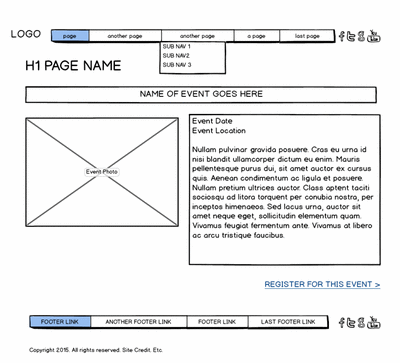

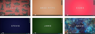
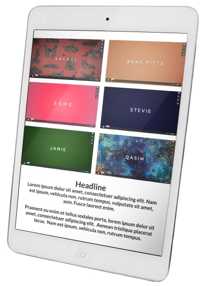


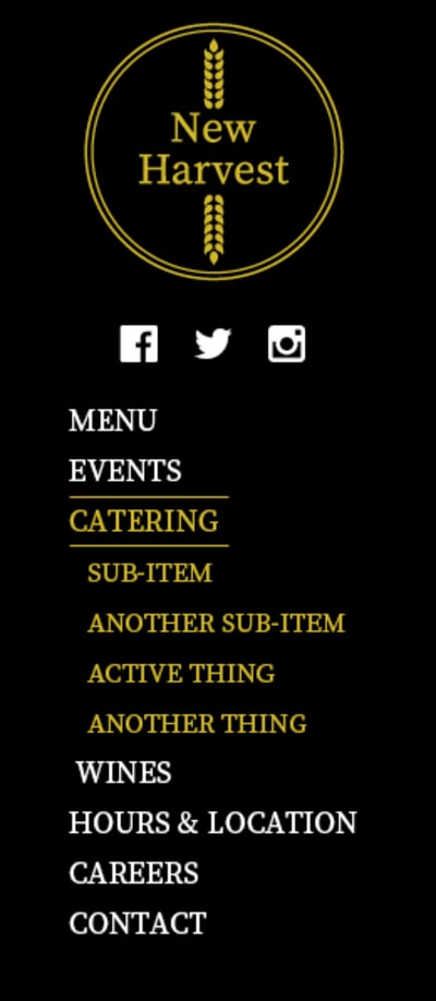


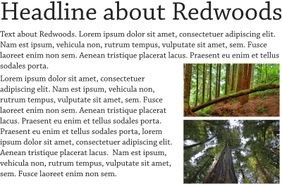
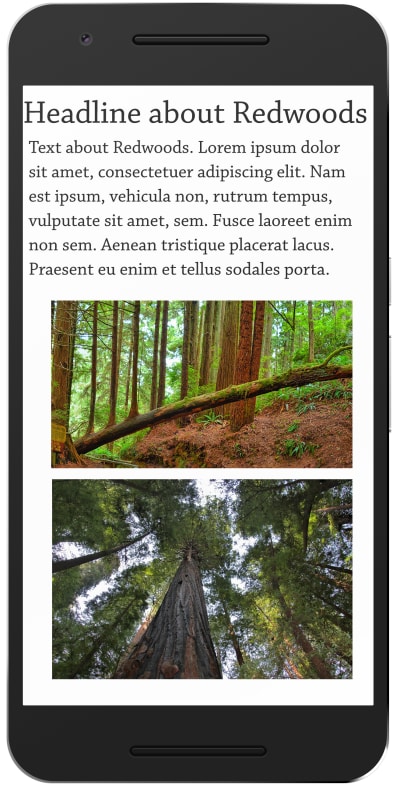


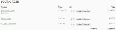
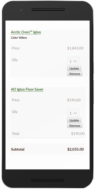


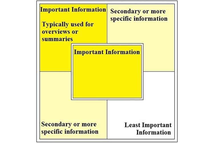
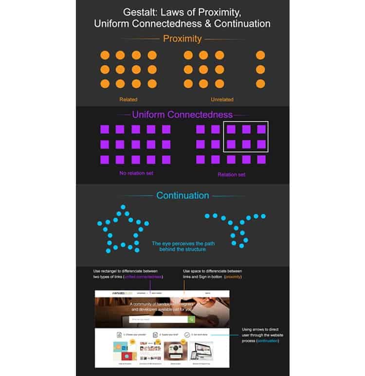
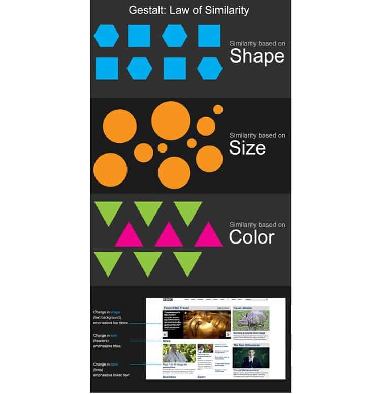


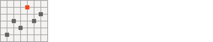


 My First UX
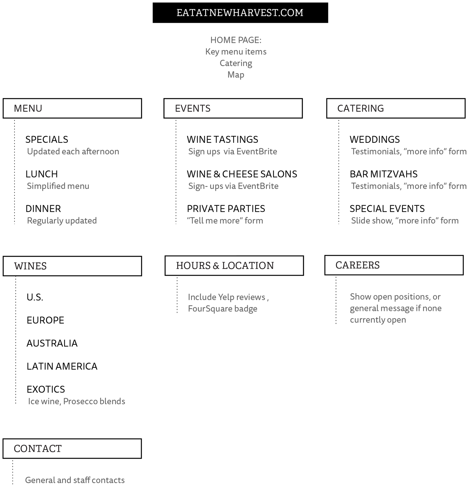